An e-commerce journey from brief to launch.
Sector E-commerce B2C, B2B
Challenge Responsive checkout design
My Role UI, UX, Illustrations, Custom Iconset
Time 3 weeks
Tools Figma, Adobe Illustrator, Adobe Photoshop
The Problem
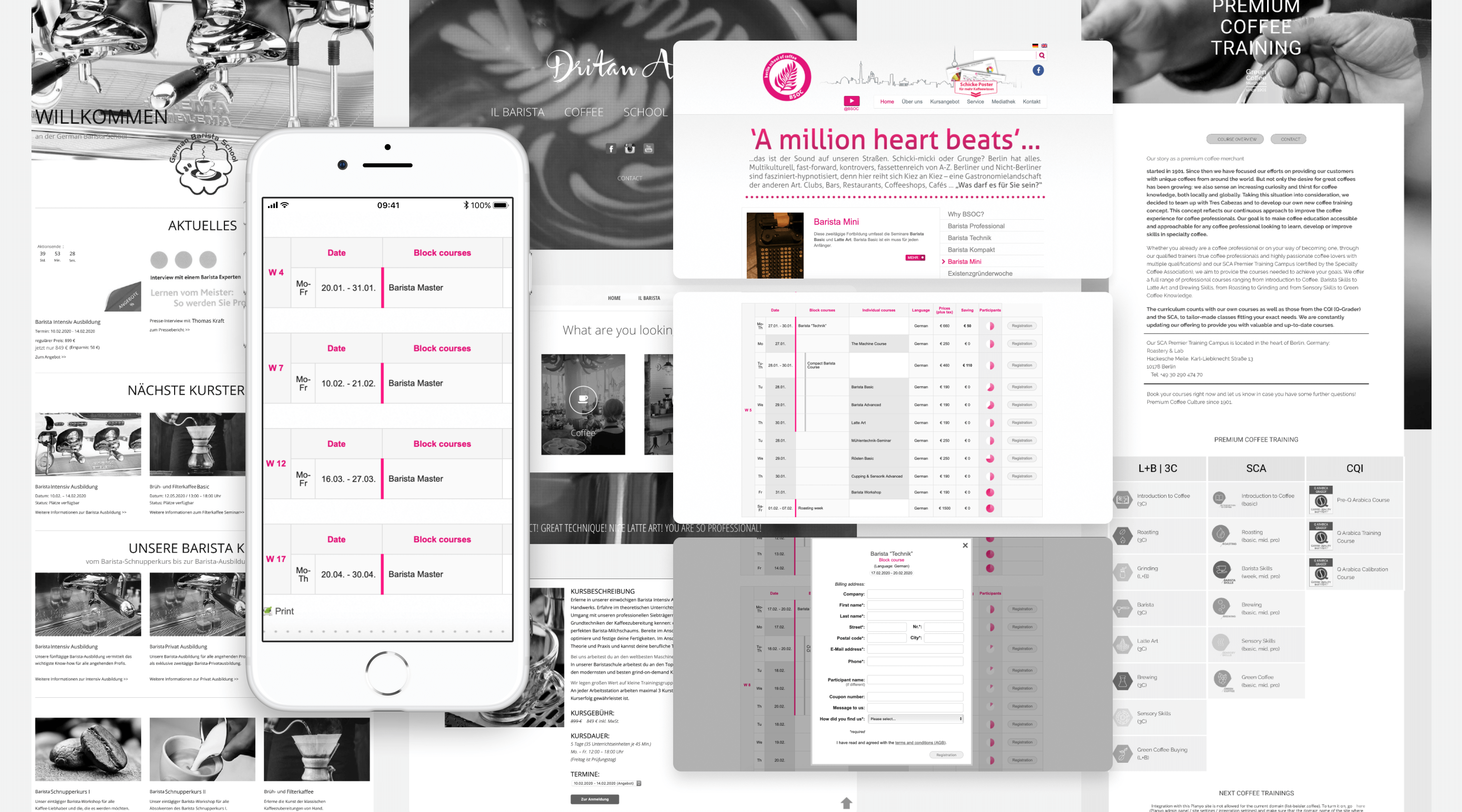
The School of Coffee needs to clearly communicate the mission, inform the visitors of the services and increase course bookings.
My challenges as a UI / UX designer
I joined with this project fulltime when the team started doing a mid-fidelity prototype. I redesigned course single page view, course calendar and added more functionality.
UX design
Most projects start with a brief to make sure everybody has the same understanding of the project’s vision and goals.
Tools and methods:
Stakeholder interviews, planning project visions and goals.
Goal:
Q: What do we want to achieve and how do we plan to do it?
We had two remote interviews, during which we asked questions and gathered stakeholders’ ideas. After conducting interviews with stakeholders, we were able to identify project goals.
- The school of coffee is a traditional school and needs to attract the younger generation.
- Customers have trouble finding a block course from calendar and to book it.
- Reconsider a number of features: canceling of a course, put on hold, send a course as a gift, etc.
- Make the checkout process more simple and intuitive.
- Make the payment approval process more clear.
Analyze
We analyzed the current situation by diving all available information.
Methods
Google Analytics review, competitor research and analysis, content audit, School of Coffee team survey, card sorting, usability testing.
Goals
Identify the pain points.
Competitors research
Competitor research and reading e-commerce checkout use cases from the Baymard Institute website helped me to reach several conclusions:
- Break long forms into smaller digestible steps.
- Eliminate distractions, links, backlinks that distract users from sign up.
- We should use step-by-step navigation with a progress bar and divide the process into small interactions.
- Q: Does the School of Coffee really need all personal data or is it possible to ask less?
- If less, then we reduce the number of fields.
- Include trust elements like security lock.

Drawing a rocket
We had a technical dilemma (because of the tight schedule and Shopware limitations) either to re-use old project components and do some light UI-changes.
We compared single-page and multi-step approaches, after analyzing all the pros and cons agreed to use a multi-step layout.

Defeating The Villain – Checkout abandonment rate
At first, I tried a single page checkout with an accordion panel.
After quick usability testing, it turned out that users struggled to complete their tasks. They had to scroll up and down and 4 out of 5 said that accordion panels were distracting.
We redesigned it so that each panel became its own page and it is known as “One Thing Per Page.”
We keep the progress bar at the top that tells the user where they are in the checkout flow. The CTA button at the bottom tells them about the next step in the ladder.
I take into account that users can change their mind at the last minute, right before finalizing the payment.
Why “One Thing Per Page” is better:
It reduces cognitive load.
Users stay on task. and reduces the chance of users giving up.
Pages will load faster and as we all know that faster pages build trust in the service.
Users don’t mind clicking, as long as each click brings them closer to their goal.

UI design
My primary goal for this redesign was to make it more attractive for a younger audience. While I still prefer a clean, minimalistic aesthetic and traditional. There’s a more brand color on the website and solid blocks that clearly differentiate the elements. I used in the two typefaces – Playfair Display and Muli because I prefer their combination with boldness and sophisticated feeling.
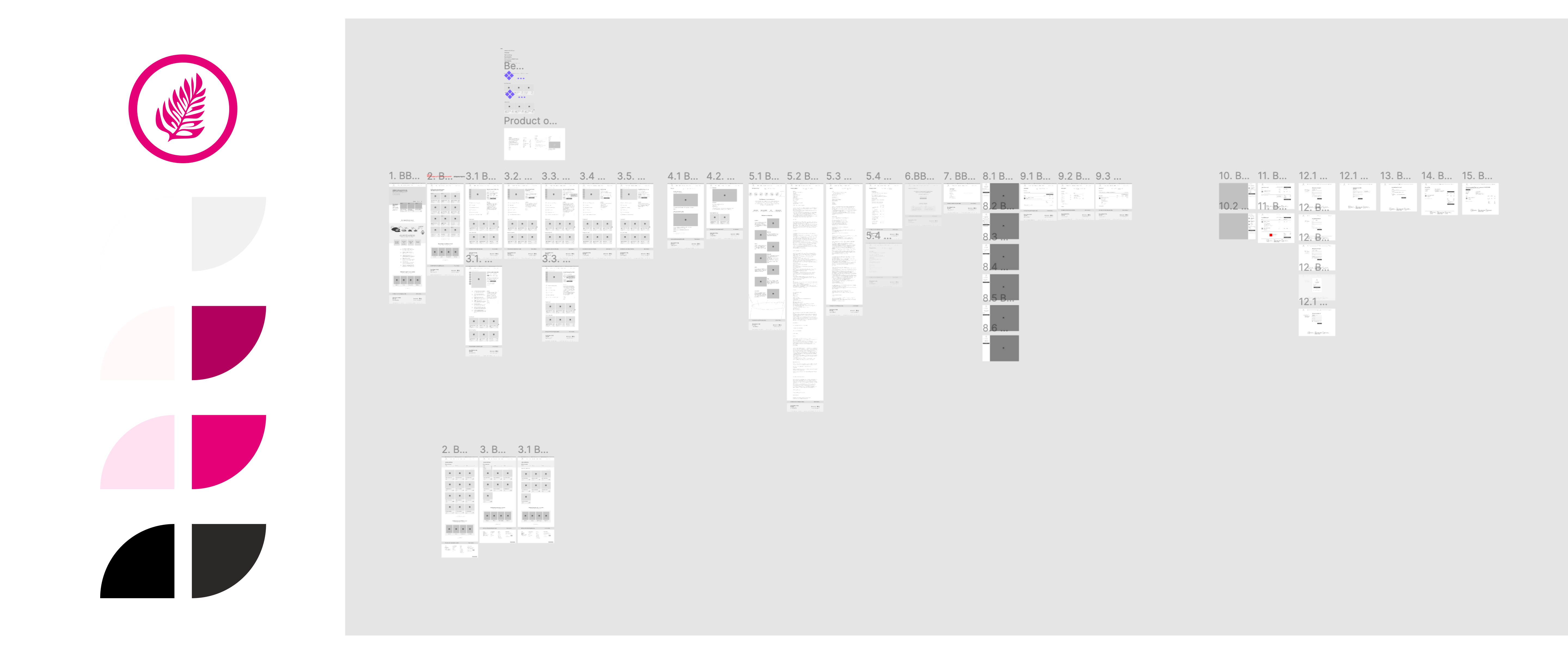
During the design process, we also redefined the visual language, color scheme, and typography. When the mockups were 70% ready it was time to create a clickable prototype and put together UI starter kit for developers.


Content design
We also helped to produce digital content.
Content design.
Production of illustrations, photos, copywriting and custom made icons.
Goal
Create a clear, consistent and effective message in all relevant user touchpoints.

Time is running out…
We put together a UI starter kit to close the gap between developers and the team. So instead of talking about design systems, we choose starter kits, components and interaction brief. Things that people could actually understand and use.
Positive outcome
The released version of the website has been well received by customers and our team. However, there are still improvements that can be made. In the future, the School of Coffee calendar should be able to filter their data even more and customize the view based on users’ needs.

The project is protected by a Non-Disclosure Agreement (NDA). This prevents me from showing the original parts of this project. Exactly the parts that make the project stand out. So, I replaced it with a similar fictional project.
