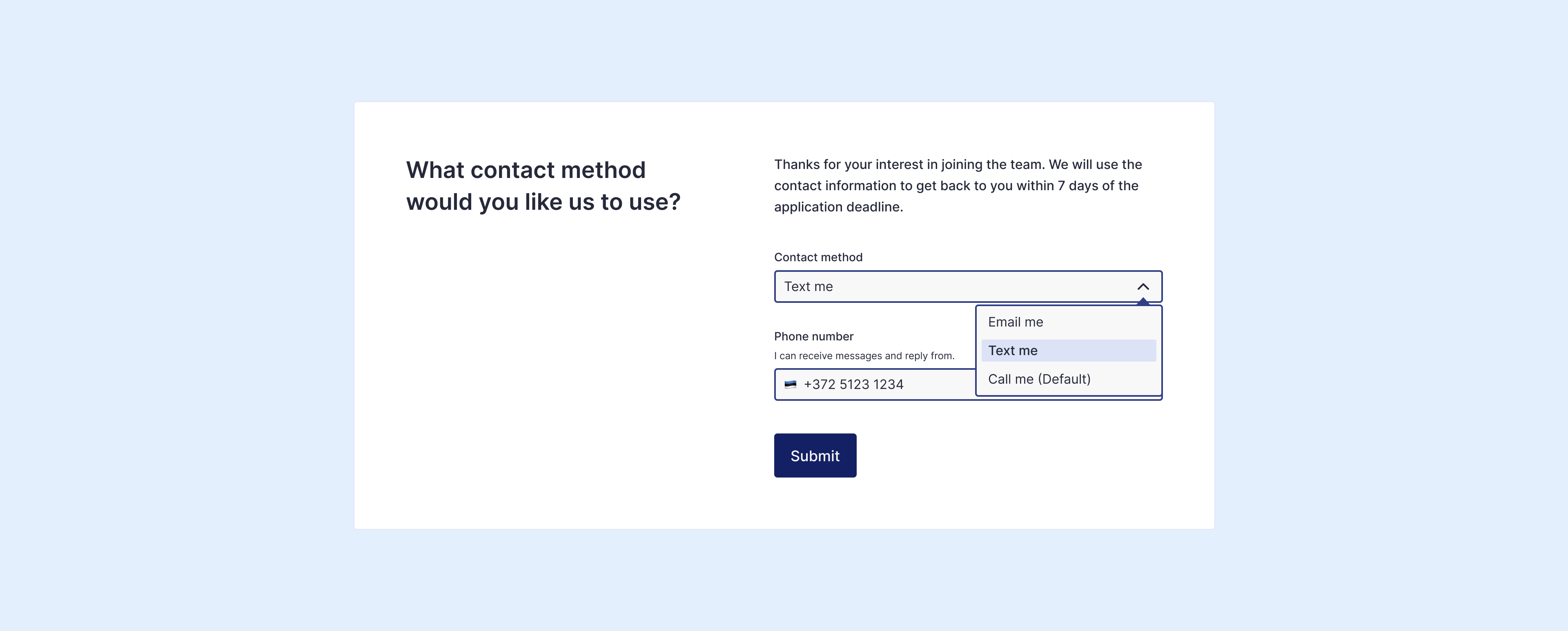
It’s time to change how we communicate and turn inaccessible communication into accessible conversation.
I’ve encountered this problem many times in my life. How to get in touch and start conversation? Usually, there’s only one way to communicate (e-mail or phone). And still contact forms and methods on a website are hidden gems or if there is a contact form, usually nothing happens after “Thank You For Contacting Us”.
Plus, I’m never sure how my contact information is being used and what happens after… Will I be added to random newsletter subscription list or what?
Problem
The job hunter felt frustrated because the application required adding a phone number. He has smartphone, he has phone number, he’s hard of hearing and he prefers texting instead of making a call.
Challenge
I know companies need to make a contact field required to ensure they can reach the person. There is an inclusive way to do this. Communication accessibility means giving people more options (at least two). For example, required a phone number. Another layer on top of this is to offer more details: call only, text only, or call and text (both are fine for me).
This isn’t just a problem with application forms, registration forms, check-out forms etc. It’s a problem in person. It’s the first impression. The design of these contact forms clearly signals that communication is for some people, and not for others.
Solution
Start small and update one of your most important contact forms. Just add more choices. The company that allows more freedom and flexibility tend to be a lot more inclusive.
And ask your colleagues, clients for their preferences for communicating. When we communicate in our preferred ways, we’re happier and we can have a conversation.

Things I’ve learned building form fields
- Text input fields must have a visible label above the input box.
- Don’t rely on placeholder text. It is not a label.
- The size (width) of the input box should reflect the intended input.
- Place helpful text under the form label. Why? Because those using a screen reader will hear the message before they fill in the field.
- Put the word “required” in the
<label>. Sighted users see the word and screen reader users can hear the word when the label is read to them.
If most fields in the form are required, should we still mark them? The short answer: for login forms is no and for longer forms is yes. Other option is to show instructions at the top of the form saying All fields are required or All fields are required unless otherwise indicated (optional). - Text needs a 4.5:1 contrast ratio against the background. WCAG 1.4.3
- Input border needs a 3:1 contrast ratio against the background. WCAG 1.4.11
